Romain Simon
Leakly AI
An MRR diagnostic tool for B2B SaaS founders. It finds where their revenue leaks and puts a figure on it in euros. Designed, built and shipped on my own, with vibe coding.
View the app- Client
- Master's final project, ECV Paris
- Role
- Designer and developer
- Year
- 2026
- Duration
- 8 months
- Scope
- Product, UX/UI, design system and development

The project in numbers
4.3/5
Trust in the diagnostic with real numbers, versus 3.0 on demo data
9
Testers, all of whom reached the diagnostic
8
Areas of improvement between v1 and the final version
Overview
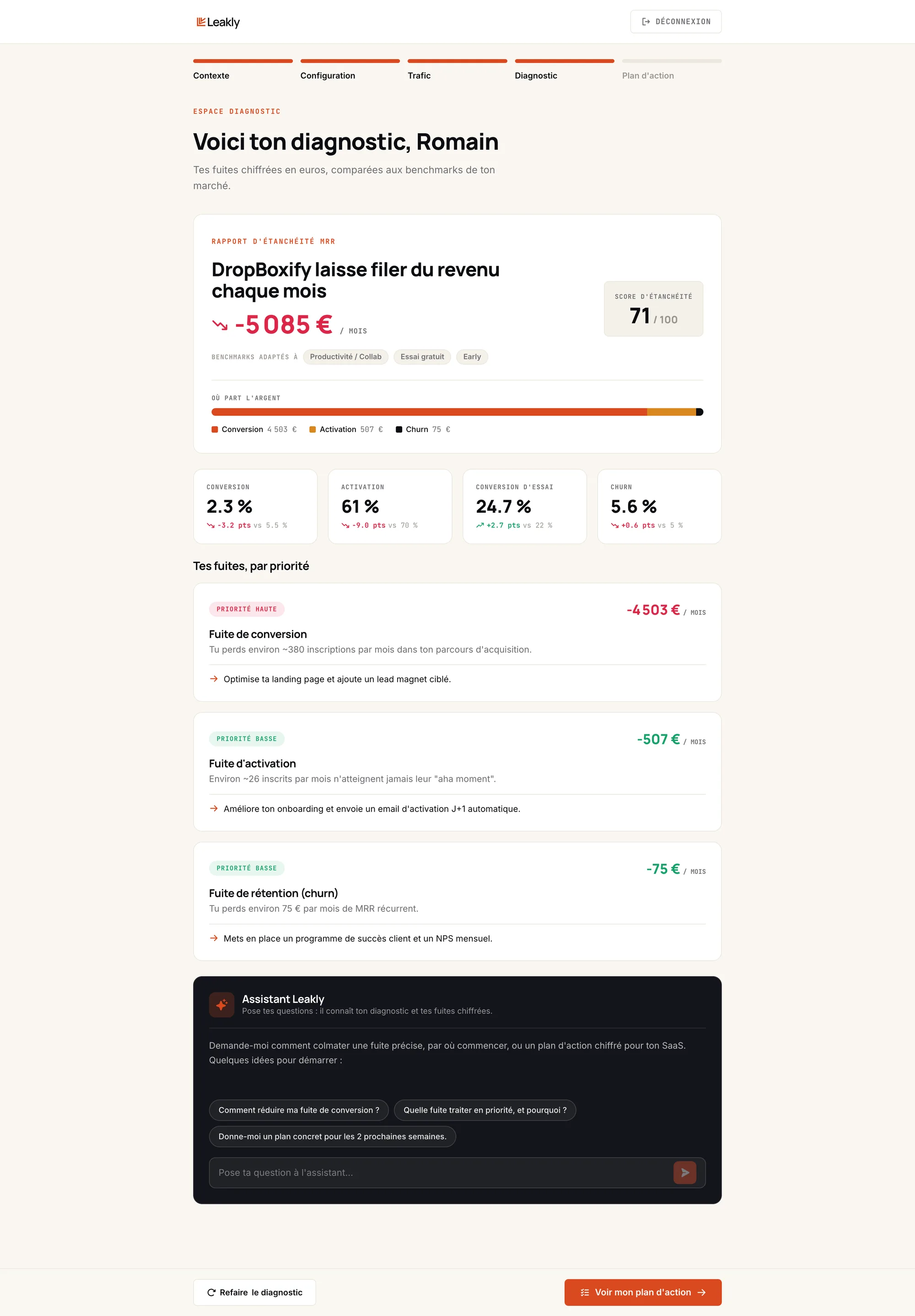
Leakly helps B2B SaaS founders turn their existing traffic into lasting MRR, by finding and plugging the leaks in their funnel with AI. It is my UX/UI master's final project at ECV Paris, from November 2025 to June 2026. It is not a mockup: the product is live.
My role
I did everything myself: product strategy, site map, interface, design system, user testing and development. I prototyped directly in code, entirely with vibe coding: first with Google AI Studio for v1, then with Claude Code for the final version. This is the project that changed how I work: I no longer stop at the mockup, I ship the product.
Origin
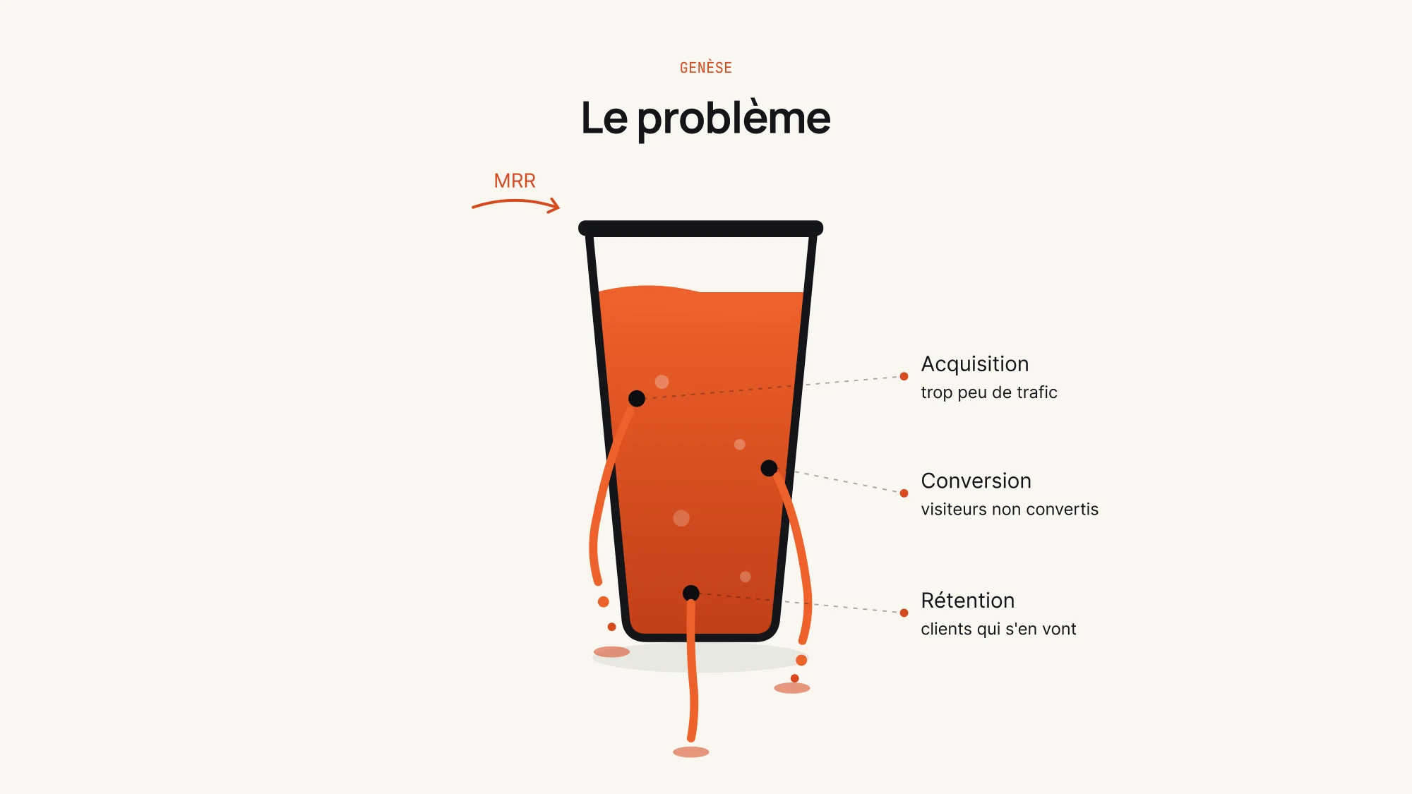
It all started with a perfect landing page, delivered to a SaaS founder. Three weeks later: +€0 of MRR. The page wasn't the problem: he had no traffic. Optimising a single step of the funnel guarantees nothing. Coaching with Alexia helped me reposition my offer around this insight: I now look at the whole system, from acquisition to retention. It led to LeakProof System, my complete coaching offer for SaaS, and Leakly, its automated version as an app.
The model
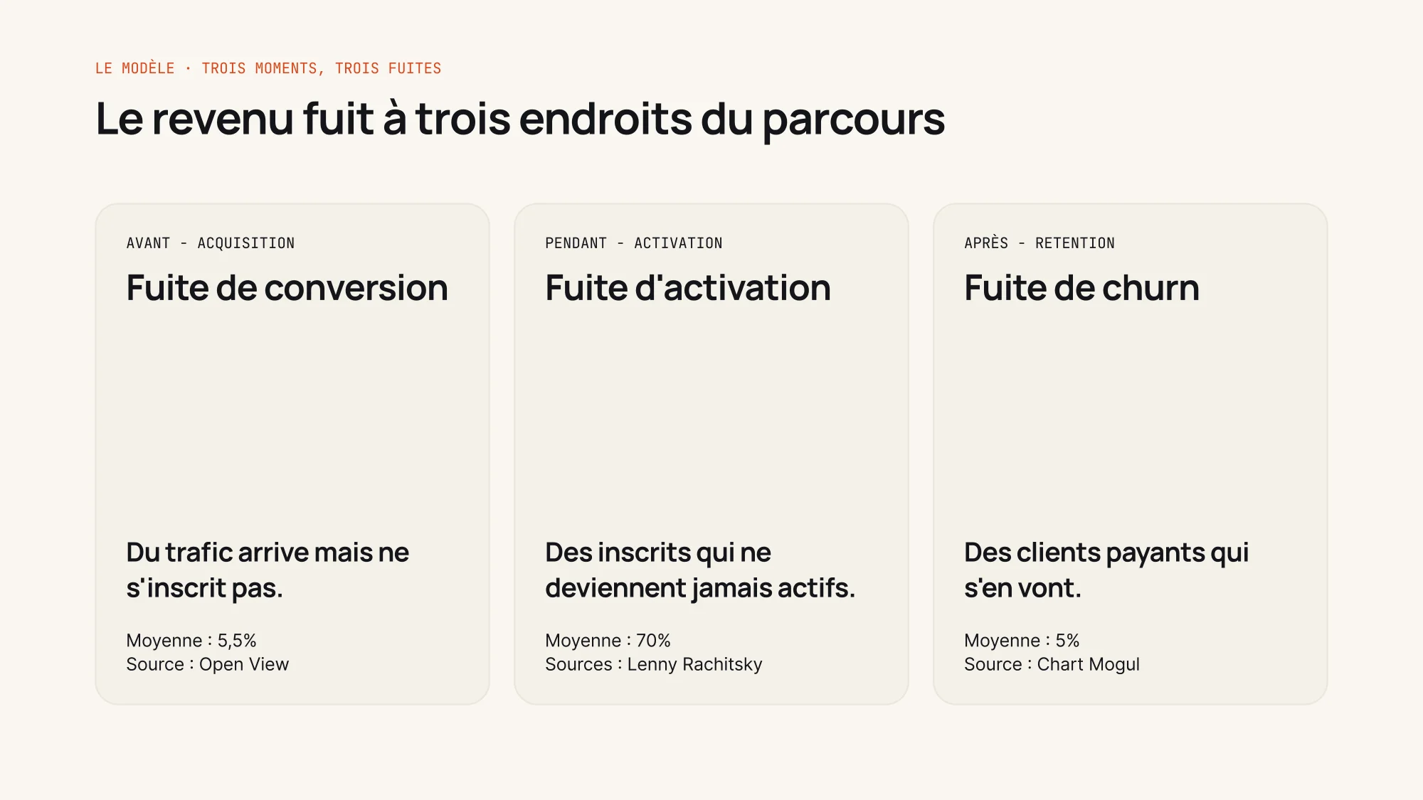
Revenue leaks at three points of the journey. Before, when traffic arrives but doesn't sign up: the conversion leak. During, when sign-ups never become active: the activation leak. After, when paying customers leave: churn. Each leak is compared with a sourced average (OpenView, Lenny Rachitsky, ChartMogul), then priced in euros. The diagnostic is free and opens the door to LeakProof System, four months of coaching to plug the leaks.
User testing
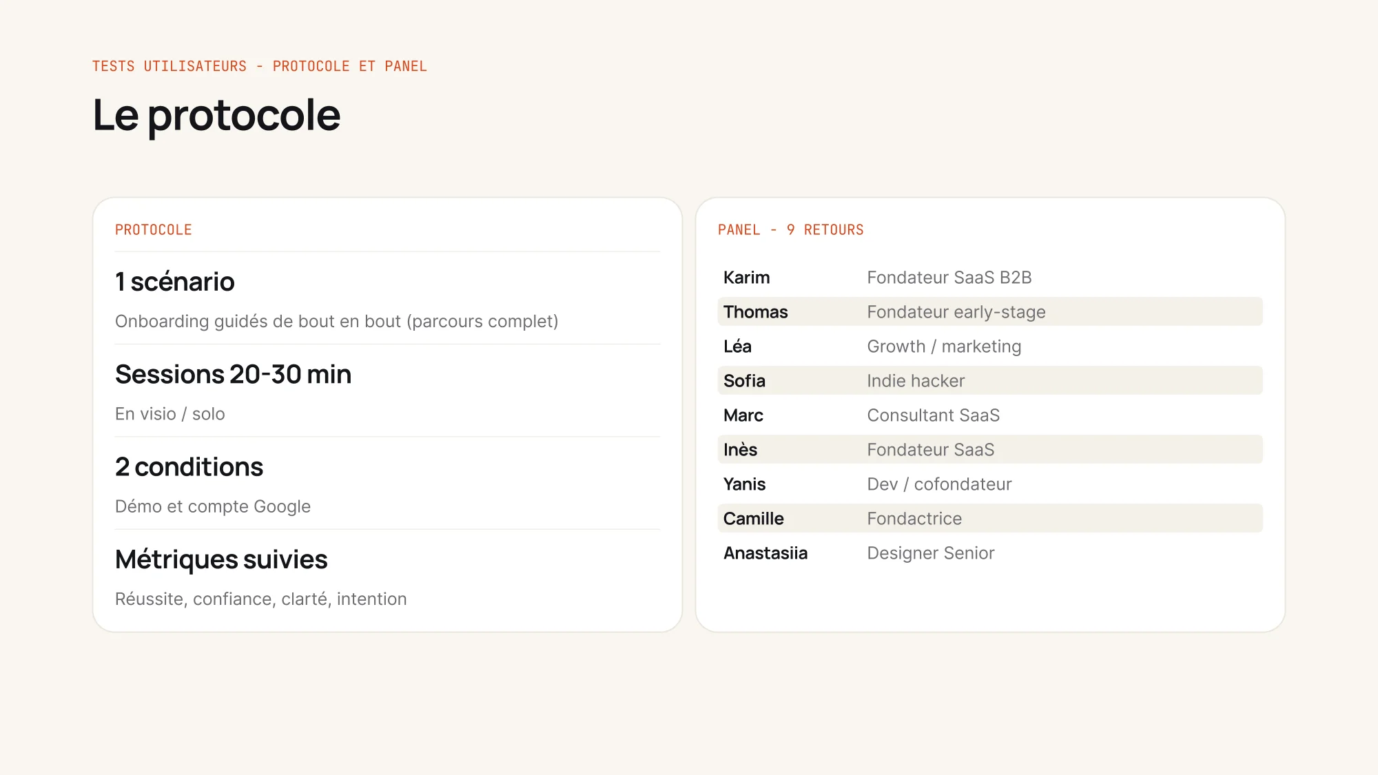
I tested v2, the first guided version, with 9 people: SaaS founders, a growth profile, an investor, a non-technical profile and one expert review. All of them reached the diagnostic and understood their lost revenue. The real lesson was elsewhere: with their real numbers, trust rose to 4.3 out of 5, versus 3.0 with demo data. “With my real numbers, the diagnostic really speaks to me,” said Karim, a founder at €8,500 MRR. Three testers also got stuck on the final “With me” button: they didn't know who they were talking to.
Design system
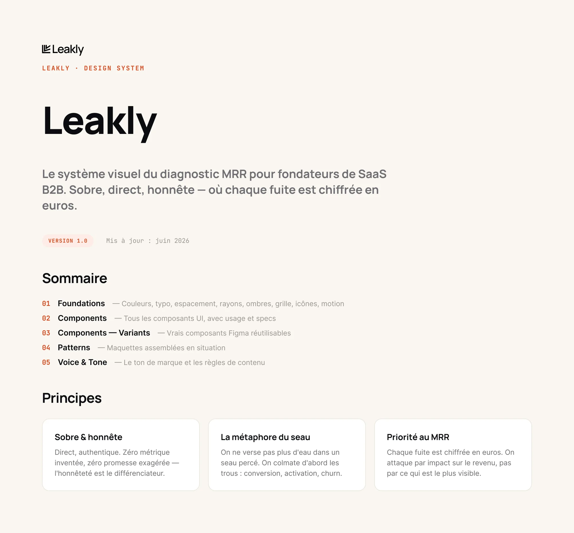
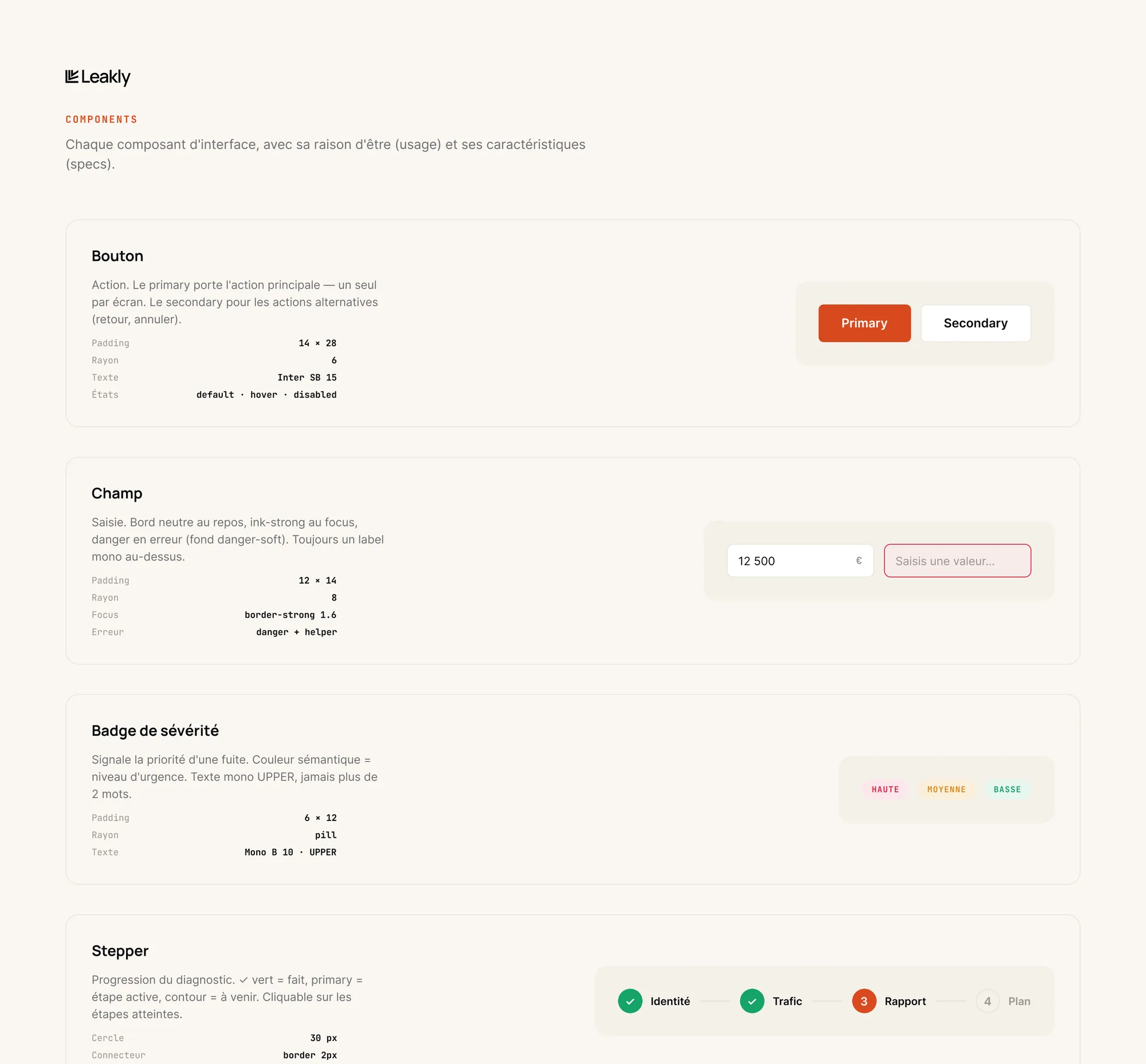
The design system grew out of the product: I built it while coding, then formalised it in Figma and documented it in Zeroheight. It covers foundations, components and their variants, patterns and a voice and tone guide. Each leak has its own colour, and the leaking bucket metaphor guides both the words and the interface.
From v1 to the final version
- 1
The first version
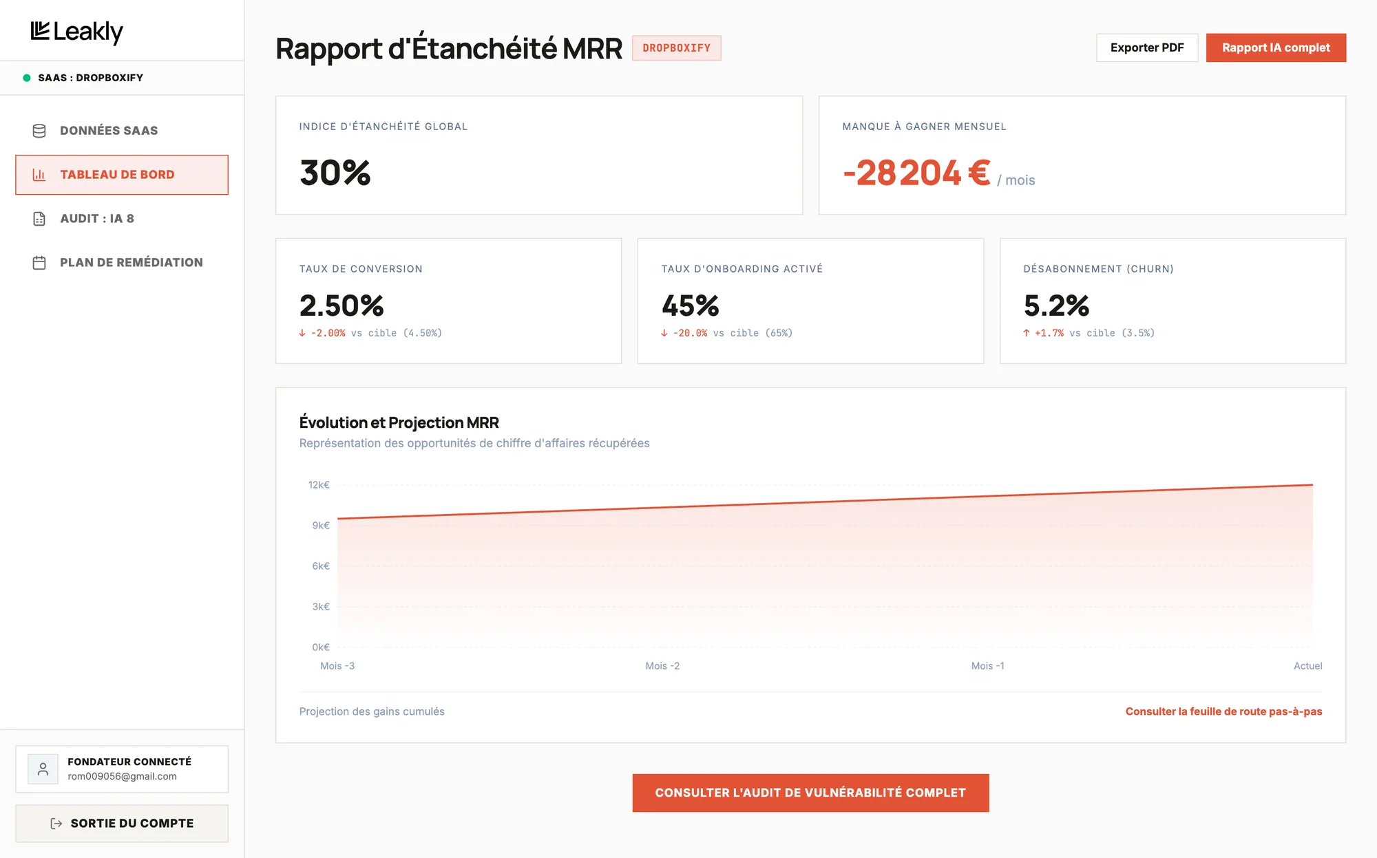
v1 was a sidebar app, deployed on Google Cloud: sign-up, onboarding, dashboard, diagnostic and action plan. User testing and jury feedback brought out eight areas of improvement.
- 2
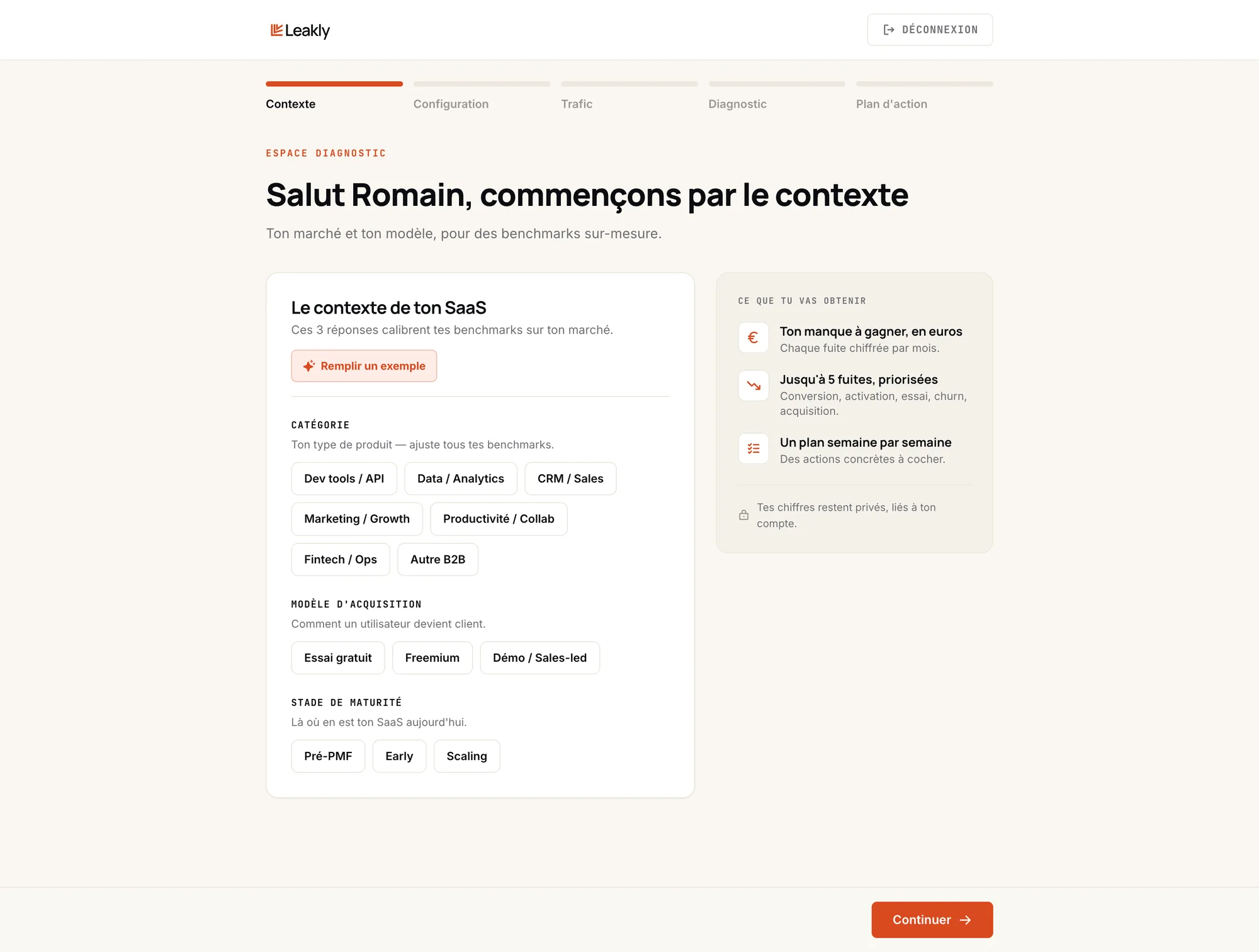
A guided journey
The sidebar forced founders to know where to go, while they were discovering the tool and only coming once. A step-by-step journey now guides them to the result, with no way to get lost.
- 3
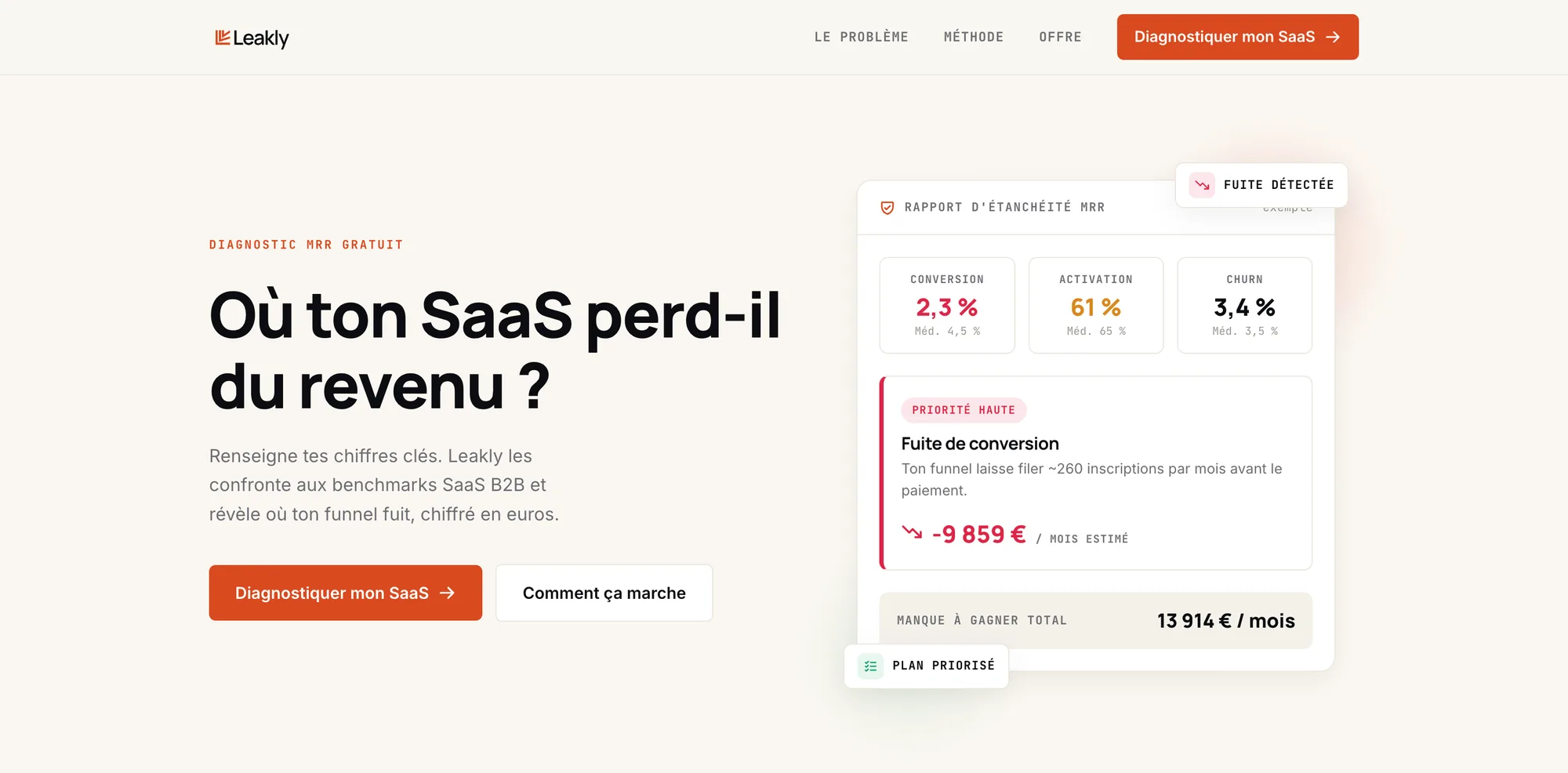
A landing page first
In v1, people landed straight in the tool: they had to enter their numbers before understanding what they would get. The landing page convinces first. It shows how it works, what you get, and that the numbers aren't pulled out of thin air.
- 4
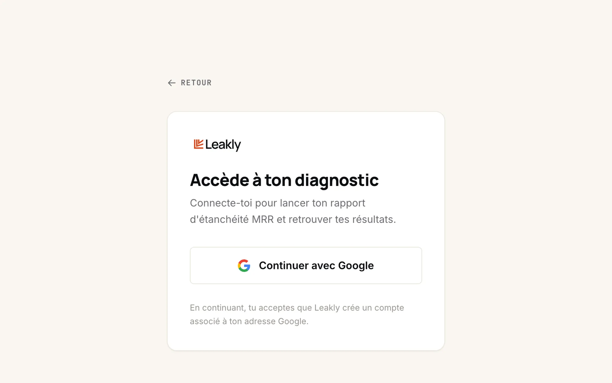
No more guest mode
Guest mode let people try the tool with demo numbers and leave with a meaningless diagnostic. Testing confirmed it: trust depends on real numbers. So I removed it, and access now goes through Google sign-in.
- 5
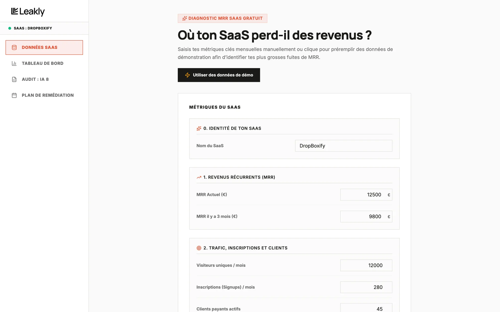
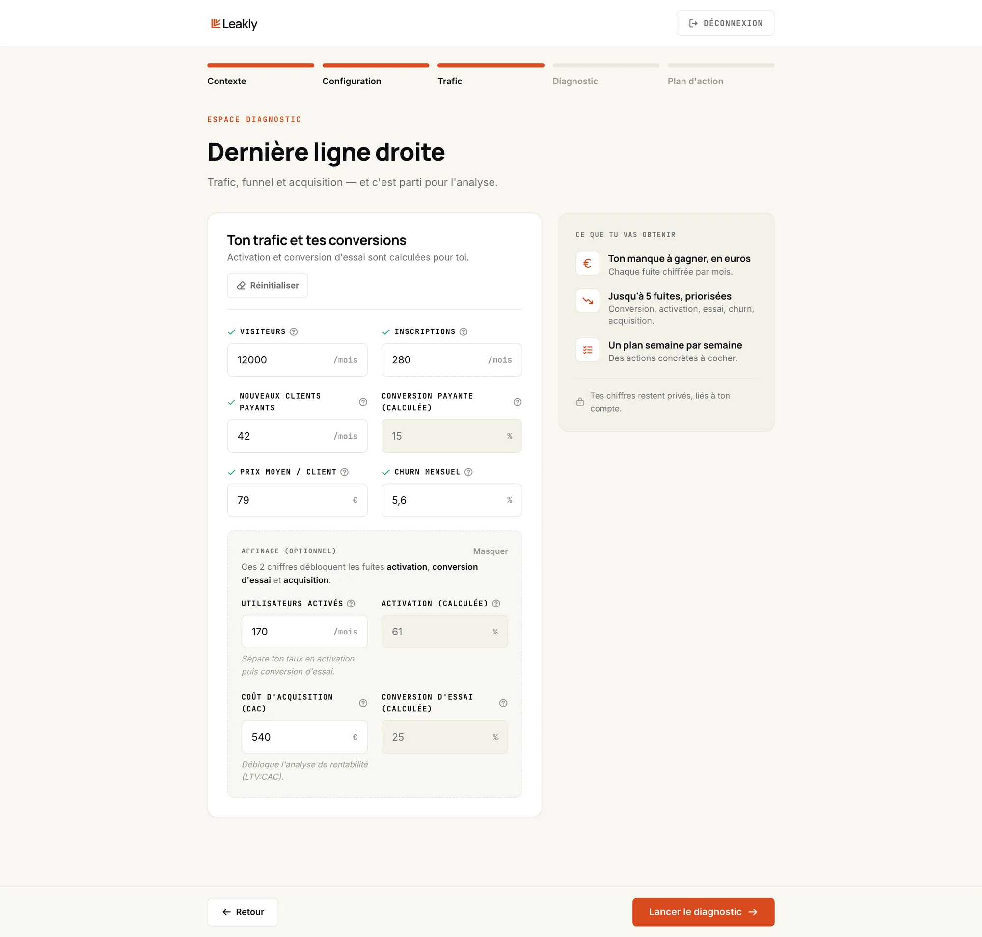
A rethought onboarding
The long form becomes three guided steps. The tool asks for the raw numbers founders have at hand and calculates the rates for them, in plain language. Less effort, fewer mistakes. Below: the v1 form, then the “Traffic” step of the final version.
- 6
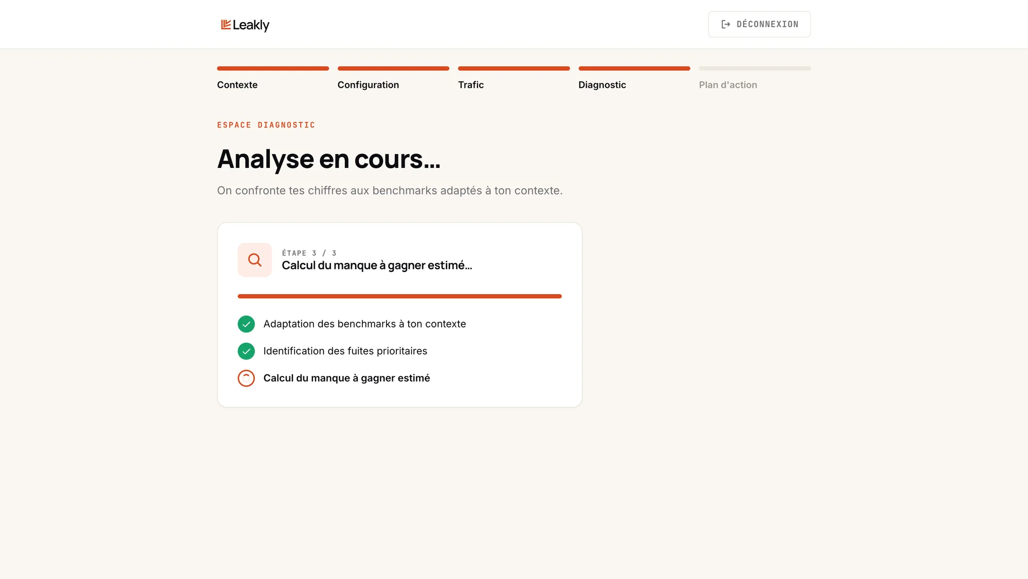
A loading screen
The loading screen turns waiting into proof: you see the tool working step by step, so the diagnostic feels more credible.
- 7
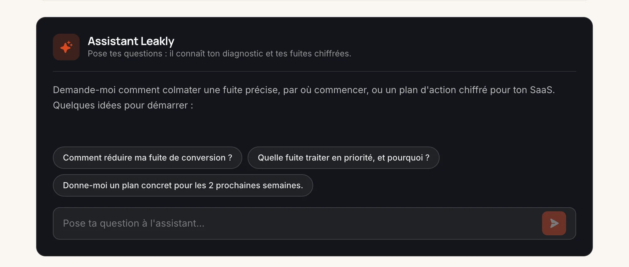
The Leakly assistant
The diagnostic gives the findings, the AI assistant gives the next steps. It answers founders' questions about their own numbers, and offers a first glimpse of what the coaching would be like.
- 8
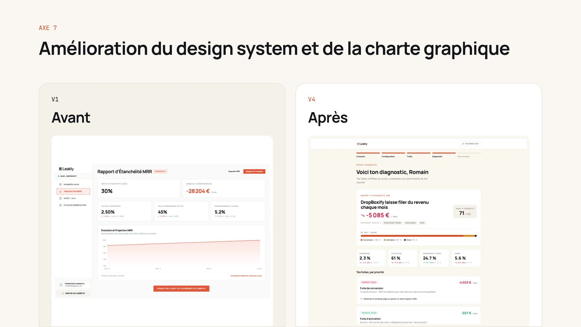
A confident visual identity
The generic dashboard look gives way to an orange, cream and dark identity, with a real typographic hierarchy and components designed for every state.
- 9
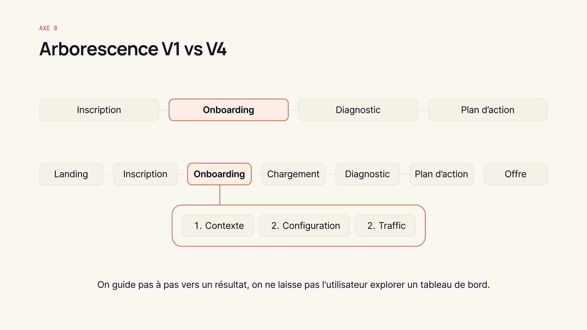
A linear site map
The site map goes from screens to explore to a linear journey: landing page, sign-up, three-step onboarding, loading, diagnostic, action plan, then the offer. We guide people step by step to a result.
- 10
The final version
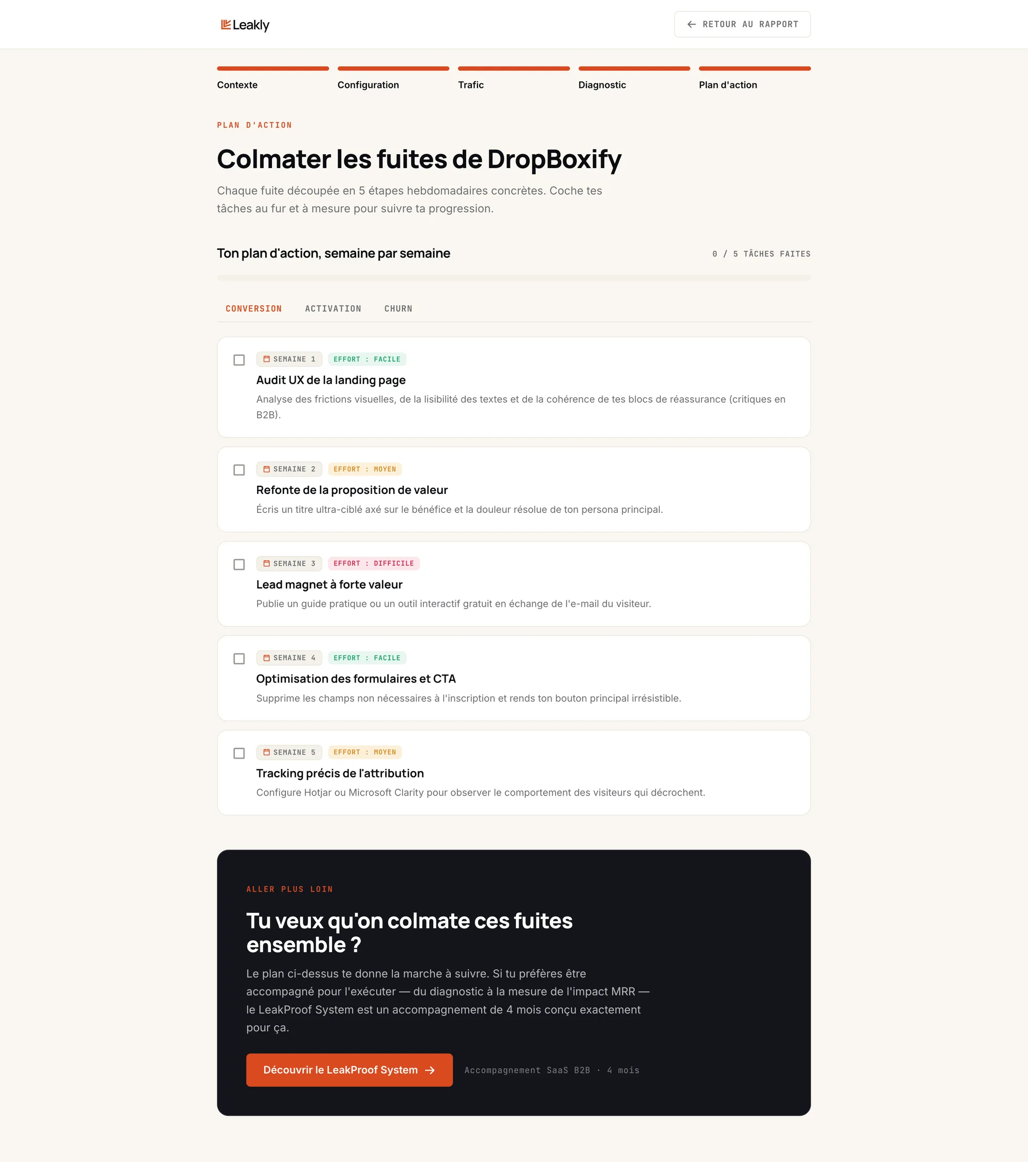
Founders get their lost revenue in euros, a leak-tightness score, their leaks ranked by priority, then a week-by-week action plan.